| �Ű�LOGO�OӋ���pƷ��LOGO�OӋ |
 |
�r��20000 Ԫ(�����) | �a�أ��V�|������ |
| ������ӆ����1�� | �l؛�أ��V�|������ | |
| �ϼܕr�g��2018-11-07 09:36:32 | �g�[����382 | |
��������c��I����߄�����˾
 |
||
| ���Iģʽ���̘I���� | ��˾��ͣ�˽�I���Y��I | |
| �����ИI���V���ý | ��Ҫ�͑���������I | |
 �ھ���ԃ �ھ���ԃ  |
||
| ϵ��:���� (����) | �֙C:13714711672 |
�Ԓ: |
����: |
| �]��:top0755@163.com | ��ַ:�����^ƽ��������N��BB1501 |
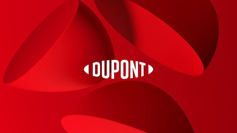
�Ű˾������״���־׃���Ű˾������״���־׃�������Ű˾��һ���Կ��О���A��ȫ������I��һֱ��ͨ�^���¸�׃�ƌW�ͻ��W�I�� DuPont Co's first landmark change in the past hundred years DuPont is a global research-based company that has been transforming science and chemistry through innovation. Ʒ�ƺ���
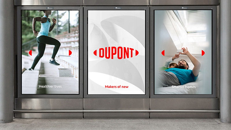
�����Ű˾��һ���Կ��О���A��ȫ������I��һֱ��ͨ�^���¸�׃�ƌW�ͻ��W�I����70�������ҽ��I�I�գ��vʷ�ƾã��c�Ї��������������ݵ��峯�����չ�������־����Ʒ��׃���һ���֡� �OӋ��˾ Lippincott  ����˼�� �µĬF������־�Aʾ���Ű����鹫˾��ȫ��Ʒ�Ƶ��D�͡���Ʒ���������c�����Կ͑��錧��Ą����Ժ�Ŀ�������Ļ��ϣ��ǶŰ����D���в�ȡ�ı����ʩ֮һ�������͑���Q���s���}��������õ��뷨�D����F������ĮaƷ�ͽ�Q������
��־�����˘�־�ԶŰ�E�A�εĂ��y��һ�������o�ԁ��������|�������ܺ������ѽ�������ӡ��Ʒ��֮�ϣ��]���˙E�A߅������ƣ���־���¶Ű��_�ŵ�˼����¡�
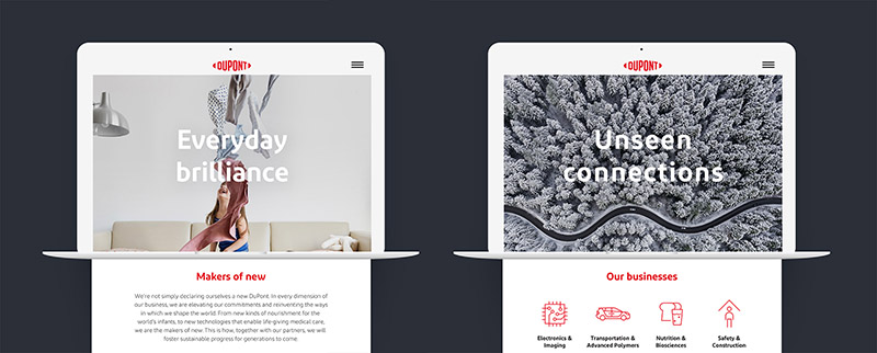 ��־�_�^�ͽYβ̎�ăɂ�С�K�ڔ���ý�w�����п��l�]�e�����á�һ�nj������D�Q��3D�Π������ǰ�l�ͳ���ʹ���@�ӵľ��^��I���ᡣ��һ�N�����������V���У����������̱��R�e���OӋ���F����đ���F�����ˑB�� ԓ��־���]���аlƷ�����w������ʹ�ìF�ɵ����w��������İ����У������nj���һ�������ஔҎģ�Ĺ�˾���f���@���DZ��^��Ҋ�����b�͘�־�����¹�˾��������׃�� Brand introduction 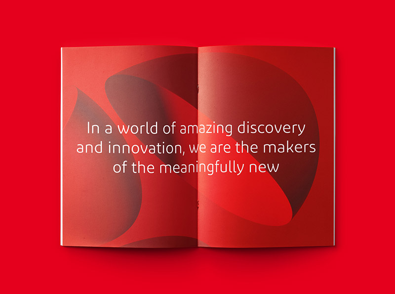 DuPont is a global research-based company that has been transforming science and chemistry through innovation. Business with China dates back to the Qing Dynasty and has a long history operating in more than 70 countries. New logos have recently been unveiled as part of a brand change. design company Lippincott Strategic thinking The new symbol of modernization foreshadowed the transformation of DuPont as a company and global brand. The new brand image, which focuses on customer-oriented innovation strategies and goal-driven culture, is one of the many initiatives DuPont has taken in its transformation to help customers solve complex problems and translate the best ideas into real-world products and solutions. Design elaboration
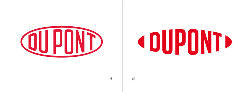
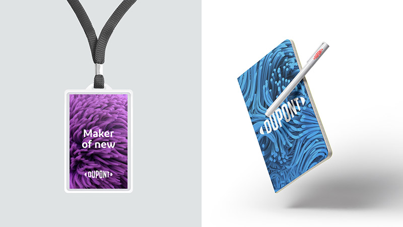
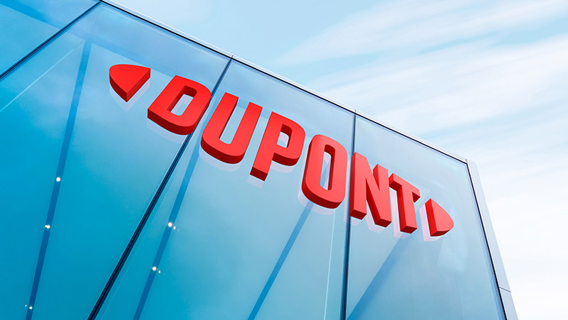
The new logo retains the iconic DuPont oval tradition. For more than a century, its quality, performance and trust have been deeply imprinted on the brand, without the limitations of the elliptical boundary, marking the new DuPont open thinking and innovation.
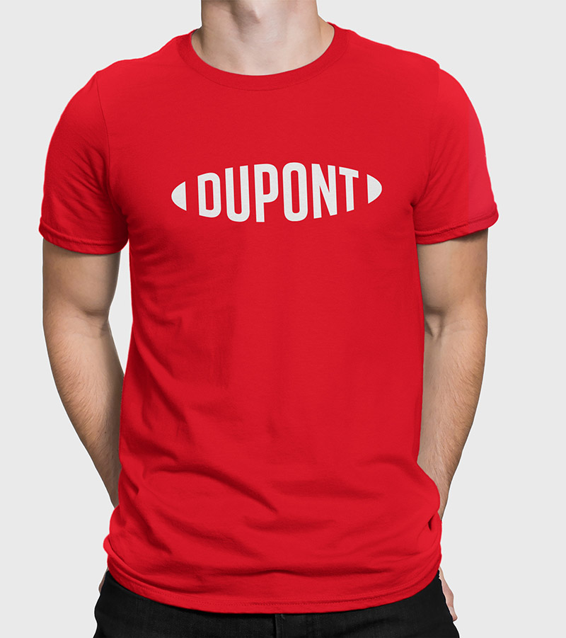
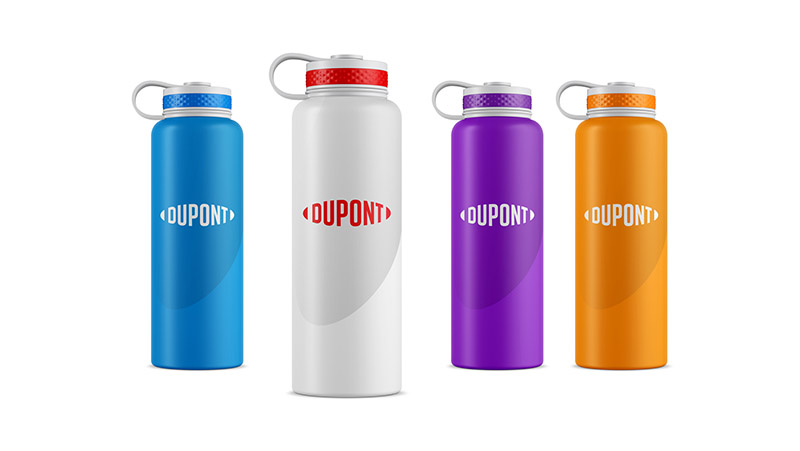
The space between the old logo "Du" and "Pont" has been abandoned. The design team also studied concepts including symbols and colours to enhance the functionality of existing trademarks by making printing more detailed and redrawing the glyph more weight-sensitive.
The two blocks at the beginning and end of the logo play a special role in digital media applications. One is to transform them into 3D shapes, which look like avant-garde and abstract. Another way is to be used in advertisements, which can be identified instantly. The design shows a bold and modern attitude.
Instead of developing brand fonts, the logo uses off-the-shelf fonts, which are rare in recent cases, especially for a company of considerable size, where packaging and logos will gradually change after the new company is established.
�gӭ�� ����������c��I����߄�����˾���ٷ��ţ�
Ո�����Ź���̖��wwwtop0755com�������Œ�������Ķ��S�a��
��������c��I����߄�����˾ ��һ����IVI�OӋ�c����߄��ľC�Ϸ����ṩ�̣��҂��Գ��Ԅ��µ�˼·��Ʒ�ƣ����������ġ��������OӋ����
�c��:156 ���ӕr�g: 2018-10-18
|
| �������������չʾ����Ϣ�ɕ��T�����ṩ�����ݵ��挍�ԡ��ʴ_�ԺͺϷ����ɰl�����Tؓ؟���C�֮�Ҍ��˲��Г��κ�؟�Ρ� �������ѣ���Ҏ��ُ�I�L�U�����h����ُ�I���P�aƷǰ�ձش_�J�������Y�|���aƷ�|���� |

�C�֮�ҾW - �C��ИI�����W�j����ý�w
�P���҂� | ϵ�҂� | �V����� | ���ʽ | ʹ�Î��� | ���T���� | ���M朽�Copyright 2011 jdzj.com All Rights Reserved���g֧�֣����ݞI�d�Ƽ�����˾
�N�۟ᾀ��0571-28292387  �ھ��ͷ���0571-87774297
չ������/�����B�ӣ�0571-87774298
�ھ��ͷ���0571-87774297
չ������/�����B�ӣ�0571-87774298
�Wվ������ԃ��0571-28292385
Ͷ�V�ᾀ��400-6680-889(�֙C7)
�Wվ���I�S���C:��B2-20080178